INDEX
ABOUT
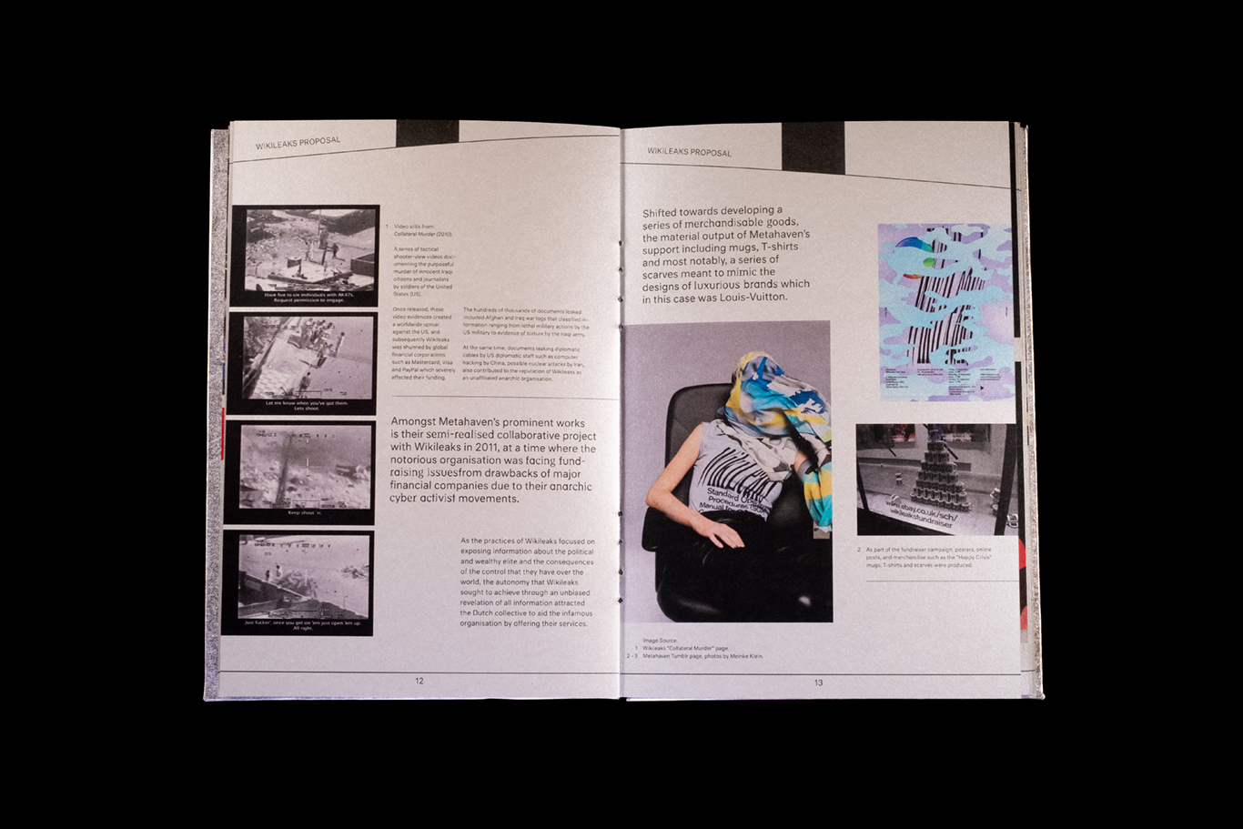
As a result of the advancement of globalisation, social, political and environmental issues have risen to the attention of designers seeking to engage in the discourse through their expertise.
In the discipline of Graphic Design, this mode of inquiry through design is currently known as Critical Graphic Design (CGD), which this compendium explores through an analysis of works by Metahaven who are the most prominent practitioners of the field.
This evaluation of the field is accompanied by critiques by respected design academics, critics and practitioners, with the compendium design inspired by the worldview of Metahaven who believe in designing virtual surfaces.
Inspired by the practice of anti-design visual approach adopted by the CGD studios mentioned in the compendium, the publication is designed to balance disorientation with legibility, by inverting editorial conventions subtly.
This is achieved by obscuring the book by printing a holographic artwork onto the book cover, placing emphasis on the running header through a black bar that increases with size as the reader progresses, interjecting paragraphs with slanted quotes, incorporating warped or stretched text as part of the decorative elements, and lastly purposefully binding the book with a black thick thread which pierce through and permeate the pages to distract or cause mild visual discomfort to the reader.


Lastly, the typefaces chosen, ‘Dead History’ and ‘Neutral’ are typefaces which reflect the need to highlight discourse through design. The former was created to evoke discourse on the nature of communication due to the invention of personal computers at that period of time, which according to its creator P. Scott Makela, signalled the end of conventional type design and traditional communications.
On the other hand, the latter was created by Kai Bernau, as a response for the need of true transparency and neutrality, void of stylistic associations that are usually affected by the type designer’s socio-cultural influences, thereby placing emphasis on the written content as a result of the typeface being “invisible” in the background.